
10 Most Common Pet Photography Editing Mistakes (and how to fix them)
Apr 09, 2020
By Charlotte Reeves
Over many years of reviewing my student's images during private online mentoring and image critiques in the Unleashed Education Premium Membership, I keep seeing many of the same issues pop up again and again. These are common mistakes, because they are all very easy to make.
The good news is - most of them are also very easy to fix! I decided to share the top ten here and make this resource as helpful as possible by also sharing how to fix them. Warning: this is a long blog post, but I believe it's also essential editing information for pet photographers, so buckle up and enjoy the guided tour!
1. White Balance not correct
White balance is one of the trickiest things to nail when it comes to editing your images - but it's also one of the most important - as it gives the image a sense of looking "right".
Setting the correct white balance is one of the very first things I do when editing an image. It forms a solid foundation for the rest of the edit. If the white balance isn’t right, it can often throw your other tonal adjustments out as well, and leave you with unwanted colour casts that you need to fix later on.
Having an understanding of natural light can greatly help in your understanding of how to set the correct white balance. Matching the final look of the image to the type of light is important and helps the image to look realistic.

White balance consists of Temperature - the balance between Yellow and Blue (or warm and cool) plus the trickier one, Tint - the balance between Green and Magenta.
Temperature is often easier to set because it’s a simple warm vs cool adjustment, and it’s usually directly related to the lighting the image was shot in. If it was shot in the shade or under cloud, the colour temperature of the light is cooler, so the image should look neutral or slightly cool. Full sun or backlit images should naturally look warmer.

Tint is the more challenging one to get correct, especially if the location was in a very green, natural area, especially in full sun. All the yellow and green light bouncing around can really play havoc with setting the Tint, making it hard to find a balance between the green and magenta.

Using a grey card or an expo disc when shooting can be a good option and is a technique that many photographers swear by. This can reduce the time you spend in Lightroom adjusting white balance, by pre-setting a custom white balance in your RAW file.
You may find this works perfectly for you straight off the bat, or it simply may provide a more accurate starting point that you can then tweak a little to make absolutely perfect.
If you find yourself struggling to manually correct the white balance in Lightroom, this is essential reading - 10 Tips for Setting Perfect White Balance.
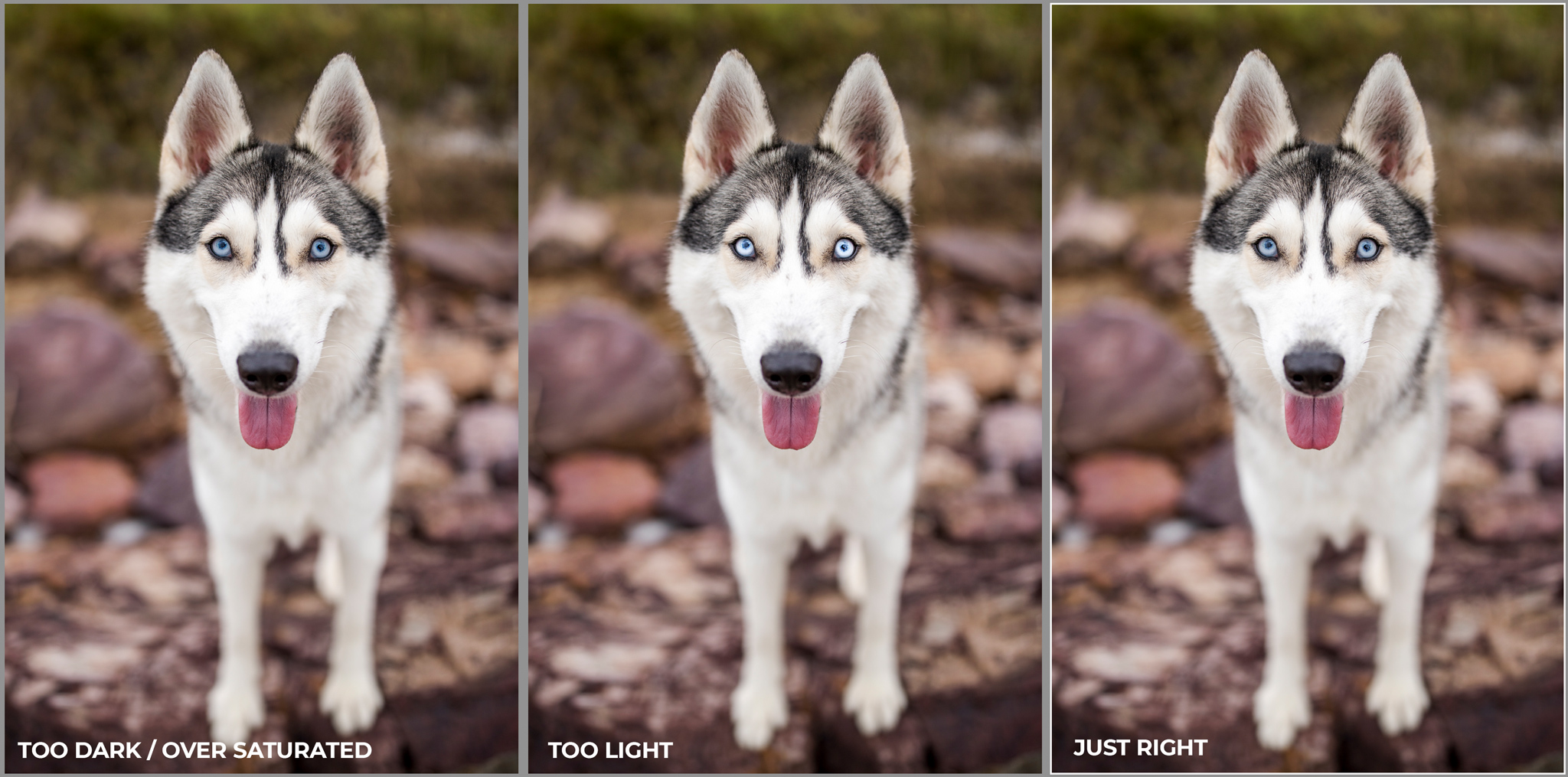
2. Image too dark or light
I’ve found that an image that is too dark or too light is most often caused by monitor brightness when editing.
Editing on a screen that is too dark will result in images that are too light.
Editing on a screen that is very bright may result in the images turning out quite dark.
This can be addressed in a couple of different ways.
The easiest fix involves calibrating your screen. Calibration devices like the Spyder (which is what I use) sit over your screen and run through a series of colour and brightness tests. As part of the calibration process, the software will ask you to turn off any auto-brightness settings, and manually adjust the brightness of your monitor. The software will then create a custom monitor colour profile for your computer, and apply that automatically as the final step.

Calibration using a device like this is not the dark art that people fear it will be. Using the software that comes with the device is super easy and takes just a few minutes. I re-calibrate regularly, and also usually re-calibrate before sitting down for a long editing session.
3. Black fur not looking black
Black dogs can be pretty challenging to photograph, mainly because the colour black is a bit special. It’s really the absence of colour in the object that gives the appearance of black. Black objects tend to absorb most of the light, so to see detail in black fur, you really need good (bright and high contrast) lighting.
In fact, photographing black dogs is such a frequently requested topic, I've written an entire article about it here - 10 Essential Tips for Beautiful Black Dogs.
I commonly see two main issues in photos of black dogs.
The first issue is black fur looking "washed out" and greyish - too light and lacking in contrast, and not properly black.
The Shadows slider in Lightroom is an awesome tool for bringing back detail to dark areas. When a dog has been photographed in low contrast light, or if the image is underexposed, you may have "filled" the shadows - usually by taking the Shadows slider in Lightroom to the right. This works perfectly to lighten those pesky shadows, but since dogs are essentially shadow, the dogs themselves end up looking grey instead of black.
Balancing out the Shadow adjustment by taking the Blacks slider down can help, but often this just isn't enough to fix the issue, as the Blacks slider is not manipulating the tones in a way that makes black fur look black.


My secret for making black dogs look black again, while retaining all that hard-won detail, is the Darks slider. Under the Tone Curve you'll find a set of sliders that look similar to the basic adjustment sliders. The Darks slider, taken to the left, brings contrast back into dark areas, without sacrificing shadow detail.


The second and probably most common issue I see is unwanted or distracting colour casts in black fur. This is most often a blue cast if the dog has been photographed in the shade, but can be other colours from the environment. Magenta or red is also commonly seen.

When I edited this image, in addition to warming up the colour temperature, I reduced the blue and magenta casts present in the black fur to make it less distracting.

The aim is to reduce the distracting appearance of colour casts by toning them down, not by removing them completely. It’s natural for a black dog to pick up some colours from their surroundings, but it shouldn’t be overly noticeable. The dog should still look black, but retain lots of textural detail in their fur.
Whenever I’m editing a photo of a black dog, I keep this mantra in my mind: Black dogs should look black. Not grey, or blue, or red, or magenta. Black!
4. White fur with no detail
Just like black dogs, photos of white dogs present their own unique challenges when editing.
White objects actually reflect all the colours in the environment - they absorb none - which gives them the appearance of white. And because white reflects most of the light, it appears brighter in comparison to the surroundings. This is great in some situations, because you can photograph a white dog in darker surroundings or with less light, and you’ll still see detail in the fur.
When shooting on manual exposure, white dogs are especially easy to accidentally overexpose. I recommend having Highlight Alerts enabled when reviewing images on the back of your camera. With this mode enabled, the image preview will show a flashing overlay over parts of the image where there is no image data recorded.

This helps you make sure you’re not overexposing your subject and throwing away the detail in these very bright areas of white fur.
Assuming you've exposed correctly, it’s important not to then lose that detail in those bright areas when you are editing. When adding contrast and enhancing the colours and tones, always keep an eye on those very bright highlights to ensure you can still see detail there.
Checking the histogram for clipped highlights (or pressing J on the keyboard in Lightroom to get a visual overlay on the image) is handy and will tell you if the highlights are clipped, however they won't tell you if there is actually any detail in those highlights.
The histogram is great, but you also need to keep tabs on those super bright white areas visually.
In this full sun image of a white dog, the RAW version on the left displays very little detail in the bright areas of white fur, even though detail does actually exist in the RAW file. In the edited image on the right, there's even less detail there. The image has been nicely brightened, but it has not been edited to retain detail in the highlights.

Here's the histogram for edited image on the right:

The histogram isn't lying, the bright areas actually aren't clipped and thrown away, there's just no visible detail there.
With careful editing however, those very bright areas of fur can still retain detail if there is detail present in the RAW file. In Lightroom, pulling the Highlights slider to the left will help preserve that detail.
In this new edit on the right, you'll see much more detail in the very bright areas of white fur.

The histogram looks similar, but without that large spike of highlight detail at the far right. The very bright areas have been toned down and more detail is now visible in those areas.

If you're still struggling to bring out the detail in the highlights without negatively affecting the whole image, using the Adjustment Brush in Lightroom may be a good option. Simply brush over the very bright areas, then pull down on the Highlights slider, or sometimes the Exposure slider works better - this adjusts only those areas and does not affect the rest of the image.
This is especially handy when the dog's coat has multiple colours. The areas I've selected to adjust below are shown via the pink overlay.

There does need to be detail there in the RAW file though, as otherwise doing this will only result in those bright areas looking grey and still devoid of detail. That's why exposing to retain that all-important detail is super important!
5. Sharpening and noise reduction mistakes
Most prosumer or professional camera bodies, coupled with decent lenses, will give you good sharpness straight off the bat - just as long as they are accurately focused and the shutter speed is high enough to rule out camera shake and motion blur.
If sharpening is required, the tools in Lightroom and Photoshop we have at our disposal to sharpen our images are awesome, but sometimes the power to sharpen can be abused. I see over sharpened “crunchy” images often.
Very closely related to sharpening, is noise reduction.
Noise is certainly something I deal with more than a lack of sharpness. Unless you’re shooting in full sun, shooting at the high shutter speeds required for freezing the motion of pets often results in high ISOs. Some cameras deal with noise better than others - ISO 800 with one camera can be super noisy - whereas ISO 800 with a different (often more expensive) camera body can be smooth and not noisy at all.
My camera does an excellent job of allowing me to shoot at high ISO with minimal noise, but in some cases where I am really pushing the limits of what the camera is capable of, I do have some noise to deal with.
Over the years, I’ve played around with various methods for sharpening coupled with noise reduction. I say coupled - because these two adjustments should be made to compliment each other - balancing out the side effects of each.
Lightroom can be a good tool for dealing with both sharpening and noise reduction.
Take a look at this image, shot at ISO 3200 and viewed at 200%. This is the default sharpening applied when you bring the image into Lightroom.

Adding sharpening without reducing noise can give images that "crunchy" look. It's especially obvious in the background, but even if you take the Masking slider up so the sharpening only applies to the edges detected, it's still not a great look.

Adding noise reduction without sharpening creates a super smooth background, but gives the whole image a plastic appearance, like objects are wrapped in cling-wrap. It almost looks like a painting!

Applying these adjustments together can help to sharpen important details, while preserving image quality and minimising noise. It's all about finding a balance between the two.

Often global sharpening and noise reduction applied to the entire image will be enough to sharpen important details, while preserving image quality and reducing noise. I always only zoom in to 100% whenever I am making these adjustments - pixel peeping is not a crime and in cases like this, can be essential for getting the best quality result.
In cases of extreme noise or softness in an image, it can be better to apply sharpening and noise reduction independently to different areas of the image. You might want to use the Adjustment Brush to add a higher level of noise reduction to the background only, where sharp details aren’t required. Parts of the image that are soft that should really be sharper, might need to be selectively sharpened.
Another fantastic tool that I use for sharpening and noise reduction are the Topaz filters - DeNoise and AI Sharpen.
6. Leashes, tags and collars - keep or remove?
Dogs frequently need to be photographed on-leash, so removing the leash in the post-processing stage is almost a given when it comes to dog photography. I have plenty of video tutorials available for editing techniques to remove leashes.
The only time I leave a leash in the shot is if it would look strange to remove it - say if it's a shot of the owners walking with the dog on-leash, or owners standing with the dog on-leash. It can sometimes be good to leave this in as a visual link and reflection of the relationship between them.

But what about tags on the collar?
This will really depend on the purpose of the image and the dog owner’s preferences. Some owners want to have the tags included because they are pretty, or meaningful, and in this case it’s fine to leave them in.

Not all tags are created equal however. When they are ugly, or worn, or obviously display the owner’s contact details, or if they are brightly coloured or distracting (council dog registration tags are never usually pretty!) - then it’s a good idea to remove them as part of the editing process.

It doesn't take long and makes a big difference to the final look of the image.

Collars are another consideration. I always encourage dog owners to think about the collar prior to the session. If the collar is old, or worn, or distractingly bright, I suggest they bring a different collar for the session - classic black is always a good option - but some owners like to make the collar more of a feature.

Just like with tags, collars and bandannas are often a fashion statement that can accentuate the image and add some style and fun!

7. Overdone eyes
So let’s talk about eyes - the windows to the soul and all. Totally cliche but also - totally true! The eyes are so important when it comes to pet photography.
Most pet photographers realise that enhancing the eyes can really improve the image, accentuating the connection between photographer and subject. Unfortunately, I see many photographers go a wee bit overboard with their colour, contrast and sharpness adjustments to dogs’ eyes - leaving them looking alien-like!
With dark eyes, often this happens unintentionally when global adjustments are made to the image to lighten the shadows. But more often than not, it's just a case of going a bit overboard with local adjustments - tweaks to the eyeballs themselves.
Here's an example of what I would consider "overdone" eyes - very bright, sharp, saturated and "crunchy".

This beautiful black and white Border Collie actually has lovely soft brown eyes that are, in real life, like milk chocolate drops - not the intense amber you see above.
Before committing to an eye edit, always check to see if the appearance of the dog's eyes have diverged too much from what they look like in real life. I like to refer back to the RAW file to check for correct colour and appearance. See how much darker and less saturated her eyes are in this slightly edited RAW file?

Instead of over-enhancing the colour and contrast, I try and keep the eyes looking natural, while slightly improving their appearance - making sure there are bright catchlights and you can see the colour and structure of the iris - the coloured bit surrounding the pupil.

Dogs with very light coloured eyes, especially blue eyes, do not need nearly as much "enhancing" as darker coloured eyes. Since they are naturally lighter, they may only need a little sharpening and no colour or contrast adjustments. Because blue eyes are so sensitive to adjustments, it can be super easy to go overboard on them as well. Darkening them too much can result in the eyes looking murky. Lightening them too much gives that "alien eyes" look. Stick with how they look in real life, true to the light.
Eye enhancements can be performed with either with the Adjustment Brush in Lightroom, or using Layer Masks in Photoshop. In Photoshop, Actions that leave you with adjustable layers are best, so you can tweak the adjustments accordingly to suit the dog's eye colour.
My eye enhancement action is part of my final "Polish Up" action that I run at the end of my Photoshop edit. It leaves me with two adjustable layers - one for sharpness, and one for contrast. I can then adjust each one independently. In some cases, I may even turn these layers off completely. Eyes don't always need enhancing!
If you're interested in learning more about my Polish Up Action, it's actually included as a download in my RealShoots course, with one of the editing tutorials in that episode including a step-by-step guide on how to use it.
You may even perform different adjustments to each eye - especially if the dog has different coloured eyes. However you choose to edit, focus on making the eyes look true-to-life. Sharp and sparkly for sure, but also believable!

And remember, the best way to get sharp, bright eyes, is to make sure they are accurately focused and well lit. It all comes back to getting things right in the shooting stage.
8. Images not straight
I’m the first to admit that when I shoot, I can never seem to get horizons perfectly straight. If you do, you're either shooting with the spirit level overlay on your camera (actually a handy tool), or you're actually an evil genius, in the same category as people who can draw a perfect circle! 😆
Horizons in my images pretty much always have a minor tilt - and depending on my position at the time of shooting - often my raw images look like they were taken during an earthquake, or maybe while on a ship in turbulent waters.
Regardless of how your RAW images look though, it’s easy to straighten them up while you are editing, to avoid that “earth is sliding” look that gives images a very unsettled feel.
When cropping in Lightroom, use the guides to make sure any visible horizons are straight.

If there are buildings, posts, fences or anything that should be vertical - use the guides adjust the tilt until they really are vertical. Leaning buildings are just as bad as tilting horizon lines!

If the horizon isn't visible and there are no verticals in the background, but your subject is positioned on something that is perfectly horizontal and is perpendicular to you, use that bottom edge as your straightening guide.

Where it gets tricky, is when the image has been shot with a wide angle lens and all the horizontal and vertical lines are, well, not very! Verticals may be leaning in from both sides, and horizontals are subject to perspective, leading off at an angle.
In this case, you just have to keep fiddling with the crop until it looks "right". Try and balance the verticals so that one side does not lean more than the other. There may be a vertical line you can use towards the middle of the image as the "straight" reference. Or you may simply base it on the subject - adjust until the dog looks like it's standing straight and not leaning over to either side.

In Lightroom, the Transform panel can correct the image for you, but I only use this for minor corrections, otherwise your main subject may end up looking a bit squished or stretched. So use these tools with caution!
Sometimes, the image may be so crooked or tightly framed that when you straighten it, you lose important parts of the image, or the crop is just too tight on the extremities of the subject. No point in straightening an image, if you lose a paw in the process!

Using Content-Aware Crop in Photoshop means you can crop “outside the image”, and PS will use Content-Aware fill in the blanks (the black areas below).

Most often, this works brilliantly, but in some cases you may need to do some manual edits to get it looking right, especially if there is lots of detail around the edges of the image. For this shot, it worked perfectly, because the edges were very plain.

Of course, there are always exceptions to the rule - not all images have to be straight - but like all cases of bending the rules, you must have a good reason for doing so.
This shot was captured while shooting blind (not looking through the viewfinder) and ended up quite crooked. Straightening the horizon in the background would have resulted in chopping off both the dog's front legs, which would have completely ruined the shot - instead I decided to keep it crooked as I feel it suits the random, playful feeling of the image.

9. Poor framing or cropping choices
Framing or cropping can make or break an image and is very closely related to composition. Composition is how the elements within a photo are arranged to be pleasing, to lead the eye around the image, to add interest and to tell a story.
Cropping is a super important part of the editing process and can have a huge impact on how successful the image is. A simple crop adjustment, even a minor one, can make a world of difference.
Experimenting with different cropping options in the editing stage can help improve your framing and composition in-camera as well. With framing and composition in mind when you shoot, you can identify issues at the time, and you don’t have to spend so much time getting it right (or fixing mistakes!) when it comes back around to editing.
My absolutely favourite type of crop, or element of composition, is the "rule of thirds" - I use this all the time and find it is the most useful of all the rules - it's just so versatile. In Lightroom, I have the "thirds" overlay always activated on my crop tool - if it isn't activated for you, hit "O" repeatedly while the crop tool is live, to cycle through the various overlays until you get to it.

You can read all about the rule of thirds and the other major rules of composition in my blog post - 13 Elements of Composition for Pet Photographers.
Cropping and composition is definitely something you’ll develop an eye for over time, but here are some common framing issues I see cropping up (pun intended) over and over again, and how you can fix them.
ISSUE Crop is too tight - not leaving enough negative space around the subject.

FIX Leave more space around the subject, give them some breathing room!

ISSUE Subject too small, or too much wasted/boring negative space. The subject gets lost in the surroundings.

FIX The obvious fix here would be to crop tighter, but that then creates another issue - reduced resolution - which may make the image unsuitable for printing. The best way to avoid this is to pay very careful attention when shooting so this doesn't happen. Nip the problem in the bud! If the subject is too far away, zoom in more, move closer, or get them closer to you. Don't always rely on cropping.

ISSUE Cropping off feet and legs.

FIX Shoot to include space under the feet, and never "chop off" the feet when you crop. If you've accidentally chopped off the feet when you've captured the image, see if you have any similar images where the feet have been included, but perhaps the expression isn't as good. Never delete any rejected images until you've finalised your editing, as you may just need to "grab" feet or other body parts from other images (and work some Photoshop magic) to fix issues like these!

ISSUE Cropping off the tops of the ears on dogs that have upright or large ears.

FIX Always move your focus point to a position that gives you enough room above to include the entire ear, and never deliberately crop off the tops of the ears when you edit. Again, you may be able to "grab" the tips of the ears from another shot to reconstruct them.

ISSUE Not leaving space for the subject to "look into".

FIX Whenever the subject isn't looking directly at the camera, leave more negative space in the image, in the direction where they are looking, to give them space to "look into".

ISSUE Not enough space left for subject to "move into", especially in action shots.
FIX Action shots freeze a moment in time, but the story of the dog in action remains, along with all that pent-up potential energy present in the shot. Always give dogs extra space in the direction of movement to "move into" in the image - and continue that story.

ISSUE Image not centered perfectly, when it should be.

FIX If centering and symmetry are the compositional elements you've chosen, fully commit! Place your subject dead centre. A slightly off-centre crop, especially if the subject is looking straight ahead, is jarring.

Framing, cropping and composition are definitely skills you improve and refine as you become a more experienced photographer. Knowing the elements of composition is a great place to start though, a little knowledge goes a long way.
10. Attention to detail
If you think of photographers you really admire across all styles and genres, I bet there’s one thing that they all do the same.
And that’s paying attention to the details.
I personally will never share an image unless it’s perfect, or at least pretty damn close!
Much of what makes an image successful is the clarity of its message. Make the main subject and story obvious and remove anything in the image that takes the viewers attention away from the story.
Basic edits like removing the leash are a given in pet photography, but what else can we do to keep the visual message loud and clear in our images?
The human eye is naturally drawn to bright areas, so if there’s anything bright in the background or foreground, it can compete with your subject for the viewer's attention.
If your subject is dark coloured, you have to work even harder to make sure lighter areas of the image aren't distracting.
I run all my final images through Photoshop before sharing them, paying special attention to anything distracting that could be detrimental to the image. Depending on the environment, this often means removing quite a lot of visual clutter!
In urban areas you might want to remove:
- Distracting objects in the background - even if the background is out of focus
- Brightly coloured objects
- Bright, blown-out spots and black holes
- Fallen leaves or weeds from man-made surfaces
- Unattractive things like lamp poles, street signs, garbage bins, cars
- Rubbish, cigarette butts
- Imperfections in buildings - marks, paint chips, missing or damaged bits
- People and other dogs
To help keep this image simple and the focus firmly on the dog, I spent time cleaning up not only the fallen leaves, but all the marks on the copper feature wall.

Worth it, right?

I only leave people in the background of my dog portraits if the person is part of the story and obviously linked to the main subject.

Removing the people and dogs from the background of this image turned it into a fairytale scene, rather than just a regular day at the beach.

If you're photographing multiple dogs in action and manage to nail a perfectly in focus shot of one dog, but also capture the other dog in the background, why not just remove the out-of-focus dog and make the sharp one the main subject? Does that other dog really need to be there?

Remember, it's all about clarity!

In natural areas, distracting elements can include:
- Stray pieces of grass, twigs and branches
- Areas of dead grass or grass clippings can be distracting if most of the grass is green
- Bright spots or blown-out areas in the background
- Dead bits of foliage, if they contrast with green or living areas
- Stray leaves on the ground, if there aren’t many other things on the ground
- Bright sun spots on the ground, making the grass fluro green or yellow, especially if they are also in focus
This is a rather extensive clean-up, but I felt it was necessary due to the busy background, to help the subject stand out more.


Here's another "spot the difference" for you to explore.


One of my pet hates is seeing gunky eyes and slobbery tongues in dog photos. Yes, dogs are more often than not rather disgusting, and always seem to have eye boogers and slobber - but this doesn’t mean we should let this "messy up" our images of them.
It only takes a few seconds to clean up around the eyes eyes, so at a bare minimum this should be something you address with every edit.


Slobbery, spitty tongues mouths can take a little longer - depending on the extent of the slobber - but this is something worth spending a little extra time on as it makes a huge difference.
You can actually watch me clean up Dice's slobbery tongue in this editing tutorial.

On the flip side, sometimes long strings of drool and slobber can be hilarious and should remain - I present to you my favourite image of all time of my own dog Luna - complete with this perfect little string of drool.

I actually had this printed as a very large canvas and I left the string of drool there intentionally because I feel it perfectly captures her personality and the story.
Sometimes, rules are made to be broken!
While all these little attention to detail items I’ve discussed can seem trivial on their own - combined they all makes a huge difference to the final look of the image. Paying attention to the details can really help your images stand out from the crowd!
If you'd like to learn more about pet photography editing in Lightroom and Photoshop and also improve your workflow, check out my e-book - Workflow and Editing Guide.
Join our mailing list!
Want to improve your pet photography with free tips and expert advice?
Join our mailing list and get a guided tour of what we have to offer, along with our weekly newsletter packed with practical pet photography insights.
📩 Sign up now and start learning with us!
We hate SPAM. We will never sell your information, for any reason.