
10 Tips for Setting Perfect White Balance
Mar 11, 2020
By Charlotte Reeves
If you’re like most pet photographers, at some point you’ve struggled with setting the correct white balance of your images in the editing stage.
I hear it all the time - “I’ve been looking at it for too long!” - and you know what? This statement is actually more true than you realise!
When you look at something for a while, your brain decides to do you a favour and tell you that the colours and tones of what you are looking at are completely normal and neutral. This is a well documented trait of our vision called “colour constancy”.
This aspect of our biology is quite useful from an evolutionary standpoint - it ensures that the perceived colour of objects remains relatively constant under different types of light. So, for example, it enables us to identify a berry as being red, regardless of the type of light we see it in.
But when it comes to editing your images for correct colour, this helpful biological trait can really work against you.
The image you’re working on may have a blue colour cast...

But due to colour constancy, your brain adjusts your perception of the image and normalises it, leading you to think it looks perfectly fine.

Colour constancy also works to keep your perception of light and dark within a constant range, which is why it can be difficult to determine if an image is too light or dark just by looking at it alone and large on your screen, with no other visual context. Your eyes and brain work together to normalise your perception of the image.
It's only when you go back to that image later, seeing it in a different context, that its true appearance is actually revealed.
White balance is something I used to battle with on a regular basis, but over the years I’ve come up with some tricks and tips for helping identify colour casts and set the correct white balance. I’ve become so adept at this, I find it quicker and easier to do than using tools while shooting - but more about that later.
You’ll find the first tips in the list below relate to setting up your workspace, then we delve into some methods for to bypassing your too-helpful brain, so you can overcome colour constancy issues and nail perfect white balance every time.
1. Understand light
Photography is literally derived from the Greek words photos ("light") and graphe ("drawing”). So basically, drawing with light. Understanding light is a crucial cornerstone of the foundation that the rest of your photography knowledge should be built upon - for shooting and editing!
I have a comprehensive and fun foundation course for mastering natural light that I recommend everyone takes - it’s really that important to the rest of your photography education journey.
Natural light always has a pre-existing colour temperature, and this is most often related to where the sun is in the sky, but also how the light from the sun is being modified.
Overhead sun is the most neutral colour, but as the sun gets closer to the horizon, the colour temperature warms. After the sun sets, the colour temperature switches to cool.
If your subject is in ambient or indirect light, where the direct sun is blocked or diffused, the colour temperature is generally neutral or cool. Shade light, especially with a clear blue sky overhead, can throw a blue colour cast. Cloudy conditions can be range from neutral to cool.
I always edit with the type of light the image was captured in, in mind. Images shot in full sun towards either end of the day will be naturally warmer.

Images shot in the shade or under cloud will be naturally cooler or more neutral.

Backlit images will have a super warm background combined with with a slightly cooler or more neutral subject.

Images shot at twilight after the sun has set will be progressively cooler as the sun dips lower.

Unless there’s clouds present, which can reflect the light from the sun onto the landscape and give warmer, pastel tones.

Matching the final look of the image to the type of light it was shot in is important and helps the image to look natural and realistic.
An image edited to look super warm, but shot in the shade, can look weird.

A full sun, late afternoon image that is edited to look neutral or cool, will also look strange.

But in some cases, you might want to accentuate the colour cast to create a mood or feeling in your image.


Keeping in mind the look and feeling you want to create in the image helps when making adjustments. Having a clear goal always helps!
2. Calibrate your monitor
Because your perception of an image is so skewed by your brain trying to help, it’s important to be able to rely on the “tools” you have at your disposal. There’s no point adjusting an image to correct the white balance, when your monitor is not displaying colours accurately. Having an uncalibrated monitor only compounds the issue and makes editing the image, in my opinion, kind of pointless.
A calibration device such as a Spyder can help eliminate issues caused by your monitor giving you incorrect colours, brightness or contrast. Regular calibration is a must for professional photographers and is something I do before every major editing session.

Most calibration software will also prompt you to adjust the brightness of your monitor, which helps prevent you editing your image to be too dark or too bright. Another very common issue!
3. Control your environment
Your environment can greatly influence how your screen appears, and how your brain interprets what you’re seeing. Make sure there are no mixed light sources (tungsten plus fluorescent lights, for example) in the room you’re working in. Coloured walls may also introduce colour casts. Some people even turn off all the lights and work in natural light only, or work in a dark room with their monitor shaded from ambient light.
Personally, I prefer to edit only during the day, with my office illuminated by natural window light. Editing at night nearly always skews my colour perception and I have to revisit the editing (especially in relation to white balance and lightness/darkness) during the day.
When I painted my new office, I made sure to use only neutral paint colours - very light grey, neutral white and a darker neutral grey.
4. Use the White Balance Selector eyedropper
If you’ve shot using a grey card (which lets be honest, isn’t usually easy to do during the semi-organised mayhem that is a pet photography session) you can use Lightroom’s White Balance Selector to set the white balance automatically. Simply grab the White Balance Selector eyedropper (keyboard shortcut is W) and click on the grey card. Lightroom will adjust the colour balance sliders so the point you clicked on becomes exactly neutral, and thus the rest of the image will also look correct.
If you haven’t used a grey card when shooting, you’ll need to instead click on a neutral coloured area. White fur, as long as it’s receiving clean light not contaminated by the surroundings, can work really well for this. Often you may need to tweak the sliders manually to get it perfect.

5. Refer to a visual reference point
White dogs, or even dogs with patches of white, make it much easier to identify colour casts and adjust the image accordingly by eye. Just as long as the white area you reference is facing a clean light source and is not contaminated by colours reflected from the surroundings. For example, watch out for green grass hues on white chest or belly fur.
Adjust the white balance until that area looks clean and neutral and you’ll find the rest of the image is usually correct as well.
One surefire way to tell if the area is devoid of colour casts, is to go to Develop module and hover over the area with your cursor, while observing the R G B values under the histogram. A neutral area will have equal (or very close to equal) values for Red, Green and Blue.

Again, this only works with white fur that actually looks white in real life, and is receiving light from a clean light source such as the open sky above.
6. Go to extremes
Sometimes it’s helpful to deliberately pull the white balance sliders too far, back and forth, in quick succession. This interferes with your brain’s attempt at colour constancy, which usually only kicks in once you’ve been viewing a consistently-appearing image for a period of time.
Going from warm to cool, cool to warm, warm to cool - then magenta to green, green to magenta - you get the idea - can unlock your vision from the controlling influence of your brain and help you see colours for what they really are.
Another method is to boost the Vibrance and Saturation allll the way up to make colour casts in neutral areas (white or black fur makes a perfect reference point) much more obvious. You can then tweak the white balance sliders to remove the colour casts, then take the Vibrance and Saturation sliders back down to zero. You'll need to wait for your eyes to adjust after doing that though - the image will appear very washed out in comparison!
Craig has created an Editing Toolbox video on this exact technique if you'd like to see this method in action.
7. Compare to correct images
Another way to break out of colour constancy is to compare the image with other edited images, that you know have correct white balance. The other images must be taken in the same type of light though - don’t compare full sun images with images taken in the shade!
In Lightroom I have Collections of images taken in various types of light - I just temporarily add the image I am editing into that collection and look at all the images together, usually in Survey or Grid view.
Here's my collection of backlit images, clearly showing the current edit as too green.
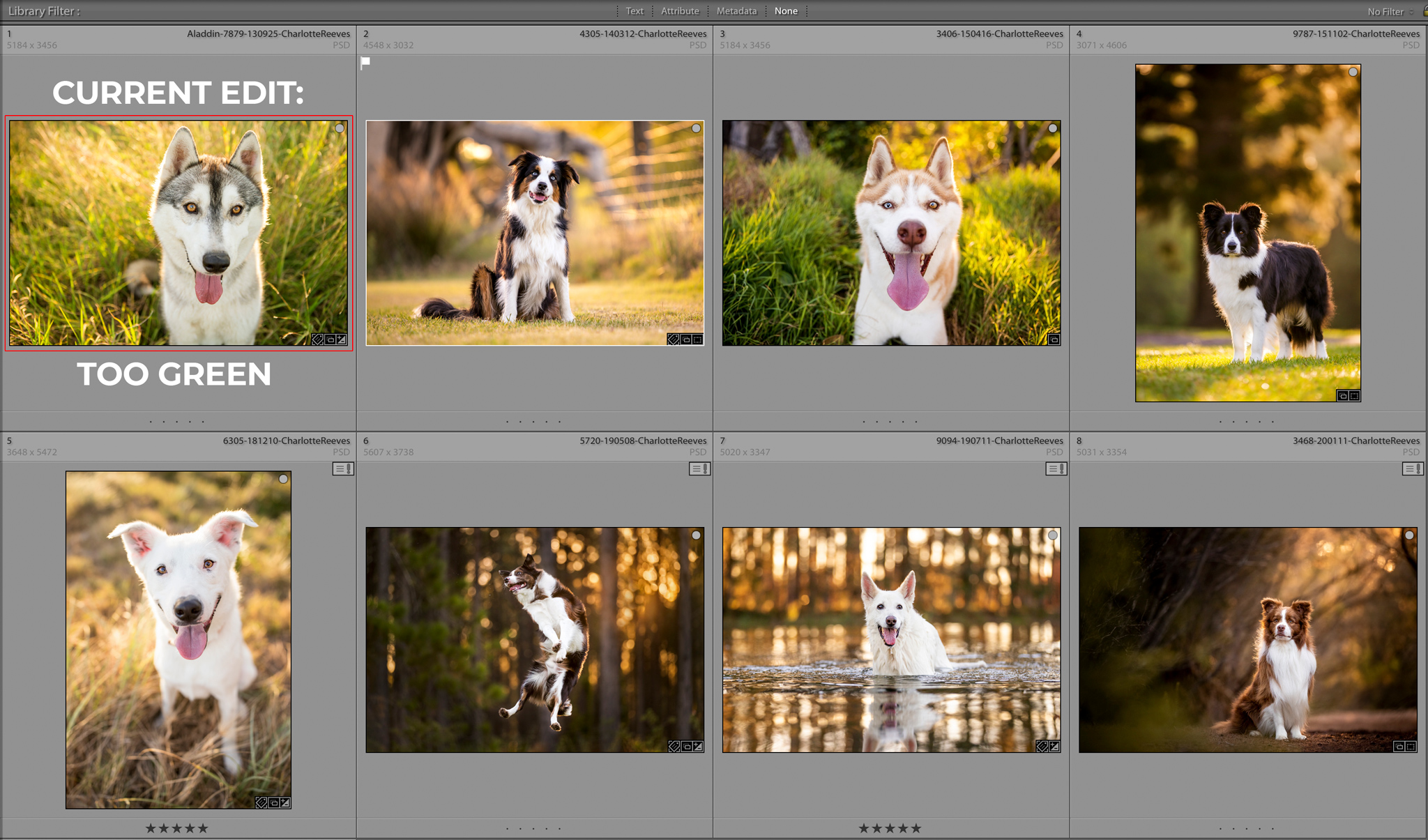
Seeing the image I am working on compared to similar correct images breaks the colour constancy deadlock and helps me quickly identify any colour casts.
8. View the image small
Have you ever edited an image you’re really proud of, then uploaded it to Facebook to share with everyone, only to see it in your feed and instantly recognise the colour as incorrect? Or perhaps it looks too light or dark? Most people tend to blame this on Facebook messing with their images, but if you’ve uploaded it at the recommended settings, this usually isn’t the case.
For the record, the recommended settings are:
- JPEG (or PNG) file format
- sRBG colour
- 2048 pixels on the long side
I edited this image sitting at the airport - in uncontrolled lighting and on my laptop. When I saw the image on Facebook, I realised it was too dark, and the white balance not quite right.

After I returned home, I revisited the edit on my iMac in my office and ended up making some adjustments to lighten and warm the image. Much better!

When something takes up your whole field of view, like an image taking up the entire monitor right in front of you as you’re editing it, colour constancy kicks in hard. Viewing it small and surrounded by other elements, your eyes and brain work together to give you a more accurate representation of its true appearance.
You can flip this issue around and use it as another tool in your quest to combat your over-helpful brain, by viewing the image very small on your screen. Zooming out in Lightroom may do the trick, or you can export it and view the thumbnail in your file browser.
Making the image small puts it in a different context, forcing your brain to analyse it in comparison to its surroundings.
It’s kind of like reverse pixel peeping!
9. Reset your eyes
Colour constancy can be a real issue for photographers and sometimes the best thing you can do is have a break, and give your eyes the “rest and reset” treatment.
Looking at clean daylight resets your vision to daylight temperature and helps improve your identification of colour casts when you go back to view the image with fresh eyes. If it’s daytime, look out the window or go for a walk outside for a few minutes.

10. Use a tool when shooting
"So hang on", I hear you say, "Wouldn't setting the correct white balance when you're shooting eliminate the need for all this faffing around with white balance when editing?"
Well, yes. Using a tool such as the ExpoDisc will allow you to do this. You simply attach the filter to the end of your lens, head over to where your subject will be and shoot a frame back towards where you'll be shooting from. Then just use that resulting image to set custom white balance in your camera, and you're good to go! Perfect white balance every time.

These kinds of gadgets are even better than a grey card, as they take in light from multiple angles and not just a flat surface, giving a more accurate reading.
Except, if you photograph dogs (and I am guessing you do or you wouldn't be reading this) you'll know how hectic dog photography sessions can get. Especially if the dog is off-leash and you're moving around, shooting in different spots with frequent lighting changes.
Personally, having to do this every time I changed spots would seriously mess up the flow of my session, especially since my preferred session style is having the dog off-leash and switching quickly between various types of light. These tools can be a handy addition to your camera bag and are great for nailing white balance in tricky or mixed lighting scenarios such as backlighting, but may not be 100% practical to use throughout the session.
As a photographer working with natural light, the ability to set the correct white balance while editing is an essential skill. I hope this post has given you a variety of different ways to speed up your editing and obtain correct white balance every time!
Join our mailing list!
Want to improve your pet photography with free tips and expert advice?
Join our mailing list and get a guided tour of what we have to offer, along with our weekly newsletter packed with practical pet photography insights.
📩 Sign up now and start learning with us!
We hate SPAM. We will never sell your information, for any reason.